6 \(\chi ^2\) tests and linear models
- Questions
- How do linear models apply when both the \(x\) and \(y\) are not continuous?
- How can I analyse counts of stuff?
- Objectives
- Appreciate that the linear model idea does not translate intuitively to this data
- Learn how to do a \(\chi^2\) test for a given number of variables
- Keypoints
- Linear models applied in the place of \(\chi^2\) tests are fiddly and in practice we are usually better off using the hypothesis tests
In the last chapter we looked at discrete data that was ordered and got around it, as hypothesis tests do, by working on ranked data with a linear model. In this section we’ll look at discrete data that isn’t ordered, or is nominal, things like agree, disagree, don't know, or yellow, green, wrinkled, smooth. We’ll also look at discrete data in the form of counts or frequencies.
6.1 The problem with unordered response data
If we have unordered categoric response data (\(y\)-axis) we find ourselves in a bit of a pickle if we want to try to apply a linear model to understand relationships, because there are no numbers at all. In every other example we’ve looked at the \(y\) response data has been numeric or at least coercible into numbers.
We’ll put ourselves in the shoes of Gregor Mendel and work through his monohybrid cross experiment on flower colour. Mendel’s first step would have been to work out the flower colours after a cross with different coloured true breeding parents, leaving him with a raw dataframe like this:
library(itssl)
its_mendel_data_time()
# A tibble: 600 × 2
cross result
<chr> <chr>
1 WP P
2 WP P
3 WP P
4 PW P
5 WP P
6 PW P
7 PW P
8 PW P
9 WP P
10 PP P
# ℹ 590 more rowsWhich isn’t very helpful at this stage, how on earth do we get two columns of text into a linear model? Persevering, Mendel would’ve gone on to count the numbers of each colour.
its_mendel_count_data_time()# A tibble: 2 × 2
colour count
<chr> <int>
1 P 459
2 W 141Mendel famously went on to calculate the ratios, or relative frequencies of each.
its_mendel_frequency_time()# A tibble: 1 × 6
P W ratio_p ratio_w freq_p freq_w
<int> <int> <dbl> <dbl> <dbl> <dbl>
1 459 141 3.26 1 0.765 0.235But that doesn’t get us any nearer. The problem is that we have just got count (or frequency) data and nothing else. It seems that it isn’t far from the ordered data case, we can imagine plotting the data as we did with HR score, but the response variable is colour and there’s no clear explanatory (\(x\)) variable, so what would go on that axis? Perhaps the colour of the parents in the cross as categories would do? There isn’t an order to this so we can’t meaningfully apply the rank to create a proxy for order. We can’t look at slopes again because there’s no sense in the order of the response variable. In short it’s a mess.
Huh?
Why isn’t colour an explanatory variable? And why can’t then frequency or count be the \(y\)-axis? Well, at a push they sort of might nearly be. But maybe not really. Remember the values of an explanatory variable should be something we can change as an experimenter, they are the values that we change deliberately to see what the effect on the response is. Even in our categoric \(x\)-experiments we know what the values will be beforehand. Here, arguably we didn’t, crosses happened and phenotypes popped out, so it’s a bit muddier. If we do use that approach we end up with lots of observations condensed into one number as a further issue.
6.2 We have to compare models, not groups.
It is possible to do this sort of comparison with linear models, but it gets to be fiddly and involved because we need to apply a mathematical transformation to our counts and to work on the likelihood ratio of the response to stick to some assumptions of the modelling process.
Briefly we go from this linear model, with interaction terms
y ~ a + b + c + a:bTo two models with logs all over them, one with interaction terms, one without
log(yi) ~ log(N) + log(ai) + log(bi) + log(ci) + log(aibi)
log(yi) ~ log(N) + log(ai) + log(bi) + log(ci)
And then we have to compare the models to see which fit the data best.
Which is more complicated than we want to get into and ultimately the process is not worth it in most cases, because there are alternatives. Pragmatically, the answer is to use the \(\chi^2\) and related tests in this case.
It is worthwhile to remember that to analyse unordered categoric response data we need to compare models, because that means assessing which model ‘fit’ the data we have best. This is a useful way to think about what the tests like the \(\chi^2\) and Fisher’s Exact test are doing. They compare the observed counts - being considered one full set of data (or one model), against the expected counts from some ideal or some category split, a second model.
The log-linear model and the tests give closely equivalent results in most cases.
6.3 The \(\chi^2\) test
In the \(\chi^2\) test we ask ‘does one set of counts differ from another?’. This might be a hypothetical ‘expected’ set of counts for the response of interest compared to some standard. For example, in genetics data we might ask whether the observed ratio of phenotypes matches an expected 9:3:3:1. More generally, we might ask whether the counts in one subset of categories matches another, so in a survey to ask whether respondents agree that broccoli is a nice food, with response ‘agree, disagree, don’t know’, we might compare responses between adults and children.
The Null Model here in this case is not the Normal distribution that we used for everything else in our linear models but a statistical distribution called the \(\chi^2\) distribution. Although it is a different distribution we use it in pretty much the same way, as a tool to give us an idea of how things would behave in a situation with no differences. Again we’re just asking how likely the differences we see would be if there was really no difference.
The basic calculation in the \(\chi^2\) test is the difference between observed and expected numbers in each category subset. In Mendel’s data this would be the difference between the observed number of “P” and “W”, from the expected number - given we did 600 plants, then for a \(3:1\) we’d expect 450 “P” and 150 “W”. This difference is then compared to values of the \(\chi^2\) distribution and returns a \(p\)-value that represents how far away from the mean the difference is. If it is an extreme value (in the tails) the \(p\)-value is lower.
The hypotheses are set as follows:
- \(H_{0}\) the observed counts show no evidence that they are different from the expected counts
- \(H_{1}\) the observed counts would not occur often by chance
6.3.1 Performing the test
To do the test for the simplest case - Mendel’s flower data, we need to get a dataframe with the observed counts on one row and the expected counts on another.
observed_counts <- its_mendel_count_data_time() %>%
  tidyr::pivot_wider(names_from = c("colour"), values_from = c("count") )
observed_counts
# A tibble: 1 × 2
P W
<int> <int>
1 459 141We then need to make the equivalent row for the expected counts - recall we had 600 plants, so calculate the expected number of “P” and “W”
expected_counts <- tibble::tibble(
   P = 600 * 3/4,
   W =  600 * 1/4
)
expected_counts
# A tibble: 1 × 2
P W
<dbl> <dbl>
1 450 150We then need to stick those rows together
chi_sq_input <- dplyr::bind_rows(observed_counts, expected_counts)
rownames(chi_sq_input) <- c("observed", "expected")
chi_sq_input
# A tibble: 2 × 2
P W
* <dbl> <dbl>
1 459 141
2 450 150Finally we can do the test with the function chisq.test()
chisq.test(chi_sq_input)
    Pearson's Chi-squared test with Yates' continuity correction

data:  chi_sq_input
X-squared = 0.29034, df = 1, p-value = 0.59
The test shows us that the \(p\)-value of the \(\chi^2\) test is greater than 0.05 so we conclude that there is no evidence that the observed number of each flower colour differs from the expected and that we do indeed have a \(3:1\) ratio. Note that the test automatically does the necessary correction for small sample sizes if the data need it.
6.3.2 More than one variable
The data we had above only had one variable, flower colour. What if we have multiple categoric variables to compare? Largely, the process is the same but making the table is more difficult.
Consider this data frame of voting intentions between generations
voting_data <- its_voting_data_time()
voting_data
generation alignment count
1 boomer fascist 279
2 millenial fascist 165
3 boomer instagram 74
4 millenial instagram 47
5 boomer marxist 225
6 millenial marxist 191This time we have two variables, with two or three levels of each. To make the contingency table for chisq.test() we can use xtabs() which takes an R formula as a description of how to make the table. Luckily, these are exactly the same formula we used to make linear models.
tabulated <- xtabs(count ~ ., data = voting_data)
tabulated
alignment
generation fascist instagram marxist
boomer 279 74 225
millenial 165 47 191Here we make a formula that says count is the output variable, and . are the independent or row and column variables (. in formula like this just means everything else). The table comes out as we expect and we can go on to do the chisq.test() as before on the new table.
chisq.test(tabulated)
    Pearson's Chi-squared test

data:  tabulated
X-squared = 7.0811, df = 2, p-value = 0.029
Here the \(p\) value tells us that the pattern of voting intention is significant, but the numbers are hard to interpret … do millenials vote less for instagram than boomers? We can make things easier to interpret if we have a proportion table. The function prop.table() can make one of those.
prop.table(tabulated, margin = 1) alignment
generation fascist instagram marxist
boomer 0.4826990 0.1280277 0.3892734
millenial 0.4094293 0.1166253 0.4739454The margin option takes a 1 if we want proportions across the rows, 2 if we want proportions down the columns. We can see that the difference between the two generations comes largely from a swing from fascist to marxist.
6.3.3 More than one pairwise comparison
If we have more than two levels in our comparison category (that is, a larger contingency table than 2 x 2), we run into a problem. Look at these data
job_mood <- its_job_mood_time()tab <- xtabs(Freq ~., data = job_mood)
tab role
mood carpenter cooper milliner
curious 70 0 100
tense 32 30 30
whimsical 120 142 110we have data on the reported mood of people in different jobs. Note that there are three levels of each of the categoric variables. We can make the table and can go straight to the \(\chi^2\) test.
tab <- xtabs(Freq ~., data = job_mood)
tab
role
mood carpenter cooper milliner
curious 70 0 100
tense 32 30 30
whimsical 120 142 110chisq.test(tab)
    Pearson's Chi-squared test

data:  tab
X-squared = 93.67, df = 4, p-value < 2.2e-16
Umm, it’s significant. But weren’t we expecting to see significances between groups? As with the ANOVA it’s done the overall result. We need to do a post-hoc operation to do the full set of pairwise comparisons. The package rcompanion has a nice function for this, pairwiseNominalIndependence(), we set the option method to decide which correction for multiple comparisons to do, fdr is a good choice.
library(rcompanion)
pairwiseNominalIndependence(tab, method = "fdr")
Comparison p.Fisher p.adj.Fisher p.Gtest p.adj.Gtest p.Chisq
1 curious : tense 8.97e-16 1.35e-15 2.22e-16 3.33e-16 1.07e-14
2 curious : whimsical 8.98e-29 2.69e-28 0.00e+00 0.00e+00 5.47e-21
3 tense : whimsical 5.98e-01 5.98e-01 6.07e-01 6.07e-01 6.11e-01
p.adj.Chisq
1 1.60e-14
2 1.64e-20
3 6.11e-01Better. But not quite! The groups compared are the different moods, presumably we wanted to look at the differences between the different roles. The table is in the wrong orientation in that case.
We can explicitly state the orientation of the table by manipulating the formula in xtabs(). Compare the results of these two calls
xtabs(Freq ~ role + mood, data = job_mood) mood
role curious tense whimsical
carpenter 70 32 120
cooper 0 30 142
milliner 100 30 110xtabs(Freq ~ mood + role, data = job_mood) role
mood carpenter cooper milliner
curious 70 0 100
tense 32 30 30
whimsical 120 142 110We usually want the form with the variable we’re comparing in the rows, that’s the Freq ~ role + mood. We can then do the pairwise \(\chi^2\).
tab <- xtabs(Freq ~ role + mood, data = job_mood)
pairwiseNominalIndependence(tab, method = "fdr")
Comparison p.Fisher p.adj.Fisher p.Gtest p.adj.Gtest p.Chisq
1 carpenter : cooper 5.26e-20 7.89e-20 0.0000 0.0000 3.38e-15
2 carpenter : milliner 7.81e-02 7.81e-02 0.0773 0.0773 7.81e-02
3 cooper : milliner 1.66e-28 4.98e-28 0.0000 0.0000 1.89e-21
p.adj.Chisq
1 5.07e-15
2 7.81e-02
3 5.67e-21And we can now clearly see the \(p\)-values across all the group comparisons. The default output is actually from a range of \(\chi^2\) related tests. In this case always take the p.adj value as the final \(p\)-value.
6.4 Summary
We’ve finally seen a situation where the linear model paradigm for thinking about statistical tests and hypothesis lets us down, the categorical \(x\) and \(y\) axis gets just a bit too complicated for the lines idea to remain intuitive, so here we must abandon it. But the alternative hypothesis tests in the \(\chi^2\) family are still available and we’ve learned some useful and general ways to apply those.
6.5 Plot ideas for categoric and count data
In previous chapters we’ve seen how to plot the data we’ve been working on and usually the sort of plot we want has been quite obvious. With the unordered categoric only data we have here, it isn’t so obvious. Often just the table will do! But if you would like some plots here are some rough examples to build from.
6.5.1 Balloon plot
library(ggplot2)
ggplot(job_mood) + aes(mood, role) + geom_point(aes(size = Freq))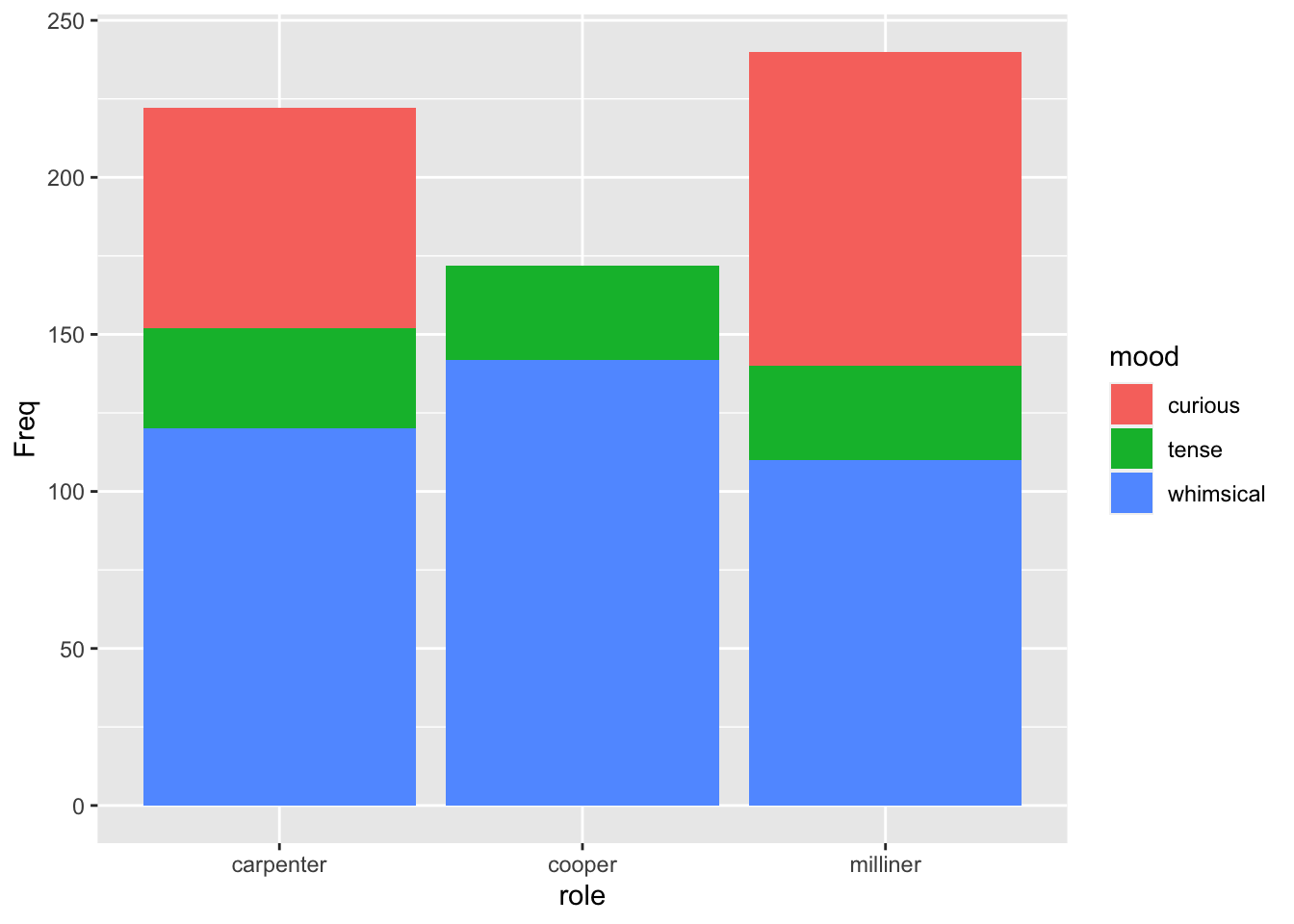
This plot shows circles whose size is proportional to the count at each combination.
6.5.2 Heatmap
ggplot(job_mood) + aes(mood, role) + geom_tile(aes(fill=Freq))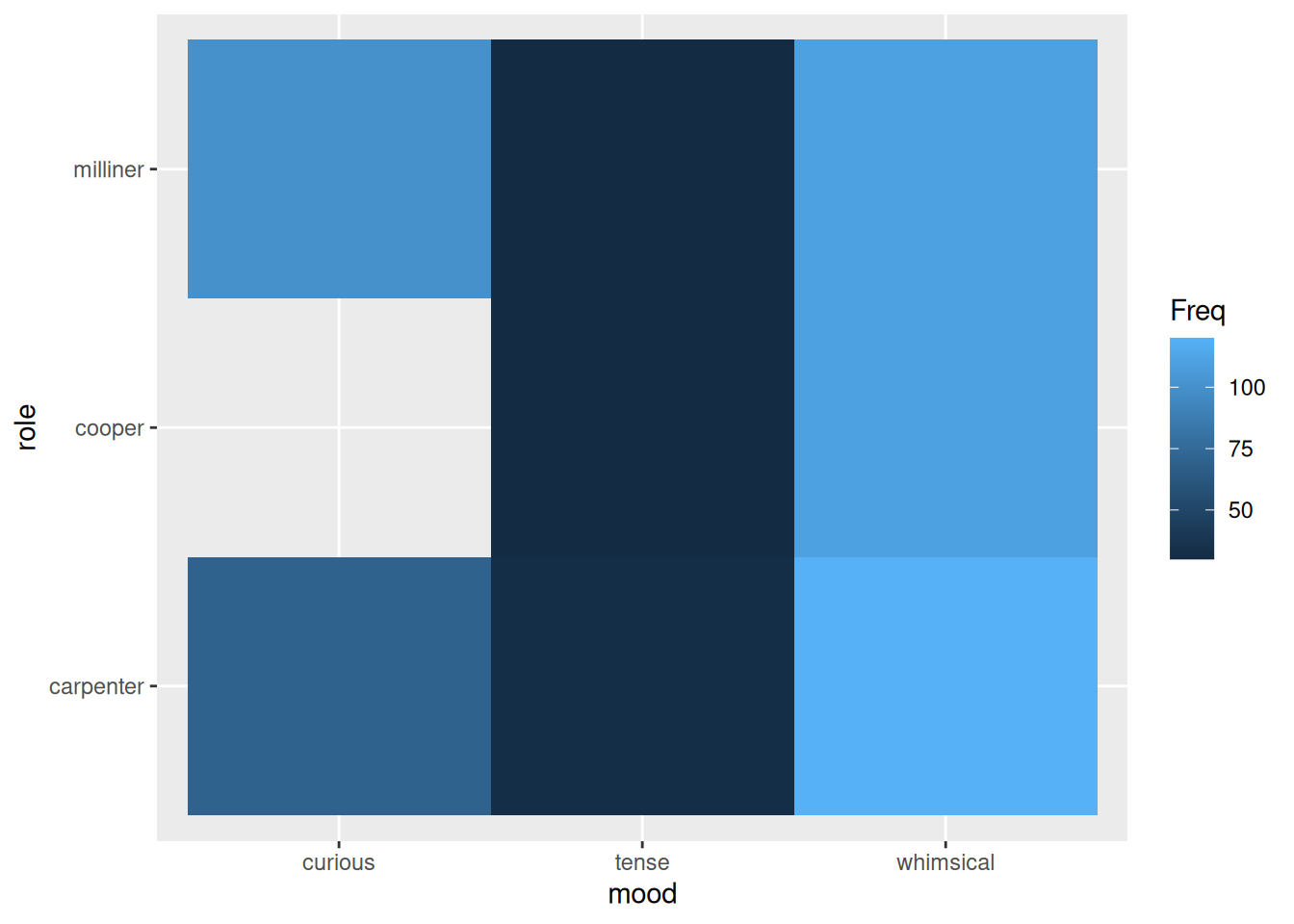
This plot shows tiles whose filled colour represents the count at each combination
6.5.3 Stacked bar
ggplot(job_mood) + aes(role, Freq) + geom_col(aes(fill = mood))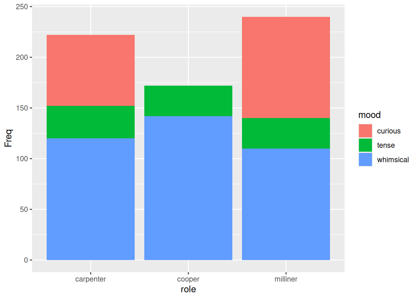
Roundup
- Categoric explanatory (\(x\)) and response (\(y\)) variables are not amenable to use in linear models
- In practice we are usually better off using the hypothesis tests
For you to do
Work through the tutorial below — the code runs in your browser. Type your answer and press Run; use Show solution if you get stuck.
When both the explanatory (\(x\)) and response (\(y\)) variables are non-continuous categories, we reach for the \(\chi^2\) test instead of a linear model. Here we’ll use a table of the adult passengers on the ill-fated ship Titanic, broken down by travel Class and Sex, in a data frame called titanic, and ask whether the split between the sexes differs from one class to another.
6.5.4 Inspecting the data
View the titanic data frame.
titanic
titanicWhich variable holds the counts (the number of passengers in each Class × Sex group)?
✗Sex
✗Class
✓Freq
To use the data in a \(\chi^2\) test we first tabulate it, with xtabs and an R formula. Put the variable we want to compare — Class — in the rows of the table. (Hint: the order of the explanatory variables in the formula decides which goes in the rows; change the order and see what happens.)
tab_titanic <- xtabs(Freq ~ Class + Sex, data = titanic)
tab_titanic
tab_titanic <- xtabs(Freq ~ Class + Sex, data = titanic)
tab_titanic
Now compare the classes pairwise. Base R’s pairwise.prop.test() tests, for each pair of classes, whether the proportion of the sexes differs — and applies a multiple-testing (FDR) correction so we don’t get fooled by doing many comparisons at once.
pairwise.prop.test(tab_titanic, p.adjust.method = "fdr")
pairwise.prop.test(tab_titanic, p.adjust.method = "fdr")